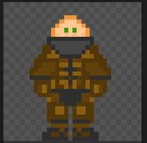
So I have tried to sprite a ghetto rocket launcher, and I have some problems.
1) How to add small annoying rotating radar dish on top of that?
2) I cant add blinking lights/lightbulbs.
3) How to make it look less awful?
Spooky sprites
-
qwert
- Joined: Tue Oct 21, 2014 2:24 pm
- Byond Username: Ohlos
Spooky sprites
- Attachments
-
- rokkitlauncherspent.dmi (383 Bytes) Viewed 2779 times
-
- rokkitlauncher.dmi (395 Bytes) Viewed 2772 times
-
420weedscopes

- Joined: Fri Jan 02, 2015 6:52 pm
- Byond Username: 420weedscopes
- Location: Bransford, UK
- Contact:
Re: Spooky sprites
it's very bright. try using darker colours. the wires, however, are fine with being bright - a lot of the wires on our sprites are already bright.
if you prefer, you can use a regular image editor (photoshop, gimp etc). byond's colour palette isn't the limit - it can handle RGBA.
the rocket and the (i'm assuming it's a) fuel cell at the back are very blocky. try giving them some more definition, and then try your hand at shading it. just one or two colours darker will be good enough.
if you want it to be animated, you need to create a 'movie'. click the film camera button, then click on the Dirs dropdown and change it to one. add frames for however many frames of animation you want. put your sprites in (with the animations completed) and it'll show you a little animation of it on the left side. another thing that a lot of people forget about is frame delay. see the little number 1s? those can be changed. it means it holds that frame for 1/10 of a second. it isn't long. naturally, 10 is one second.
right click on one of the frames and click Edit Delay... you'll get a little window come up. there's two tickboxes that can be useful too. change the value from 1 to 5 and watch your sprite wait.
this dmi shows you frames and the delay with my oat sprite. it also shows that some sprites need to be in a certain area: the plant is raised because the hydroponics planters and dirt are laid under it in game. the space below it makes it look like whatever's there is in front of the plant. this gives the illusion of it being planted.
- Attachments
-
- wangs.dmi (5.03 KiB) Viewed 2763 times
Check out Phoenix Bucket!
MORE http://i.imgur.com/335AGAS.jpg
original fanart by TheWiznard http://i.imgur.com/TTd3AFt.jpgTheWiznard wrote:jmad you read a book out loud to no one for two hours
MORE http://i.imgur.com/335AGAS.jpg
-
John_Oxford

- Github User
- Joined: Sat Nov 15, 2014 5:19 am
- Byond Username: John Oxford
- Github Username: JohnOxford
- Location: The United States of America
Re: Spooky sprites
I really don't bother with dream daemon's sprite maker, i personally think its shit.
This is what i use:
http://www.piskelapp.com/
I agree with 420, its very bright. Making a actual rocket launcher, then trying to make it ghetto, is a whole lot easier then making it ghetto from the start.
Here, i made one, this is a non ghetto version, take some of my ideas and incorperate it into your design.
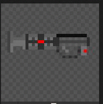
Make the outline/shape that your happy with in a light grey (Gonna shade it later)
Fill in the inside with portioned sections of darker greys ( Rocket Exaust port, Rocket Holding Area, Barrel)
For this i made checkered/staggered patterns to make it seem like a grip pad/circular
Fill it in, add your patterns to the side of the rocket, add trimming details (Recolor some of the ends, increase what you think needs increasing, decreased ect ect)
Then add color, Your lights, wires, fire, smoke, ect ect.
Don't overdo the color, these are some examples of slightly adding lights and colors, this is good:
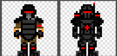
This is a example of to much color, this is bad:
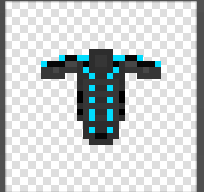
Some things, don't really need any bright colors, this is a grim, moody, boring space station after all?, This is something that doesn't need alot of colors, for example:
But above also needs shading.
Don't shade by making lighter circles as you go in, thats called sphereing, and its bad, because you aren't making spheres.
Generally, light comes from above you, at any angle, make it so the top edges/corners are a darker shade
If your sprites small enough, don't bother shading it, you will kill yourself trying to figure out how to not change the entire color of the object your shading.
Generally, from your picture, all you need is less bright colors, and more shading. Try making things blend together a little bit better, instead of it being PART A IS NEXT TO PART B IS NEXT TO PART C.
This is what i use:
http://www.piskelapp.com/
I agree with 420, its very bright. Making a actual rocket launcher, then trying to make it ghetto, is a whole lot easier then making it ghetto from the start.
Here, i made one, this is a non ghetto version, take some of my ideas and incorperate it into your design.
Make the outline/shape that your happy with in a light grey (Gonna shade it later)
Fill in the inside with portioned sections of darker greys ( Rocket Exaust port, Rocket Holding Area, Barrel)
For this i made checkered/staggered patterns to make it seem like a grip pad/circular
Fill it in, add your patterns to the side of the rocket, add trimming details (Recolor some of the ends, increase what you think needs increasing, decreased ect ect)
Then add color, Your lights, wires, fire, smoke, ect ect.
Don't overdo the color, these are some examples of slightly adding lights and colors, this is good:
This is a example of to much color, this is bad:
Some things, don't really need any bright colors, this is a grim, moody, boring space station after all?, This is something that doesn't need alot of colors, for example:
But above also needs shading.
Don't shade by making lighter circles as you go in, thats called sphereing, and its bad, because you aren't making spheres.
Generally, light comes from above you, at any angle, make it so the top edges/corners are a darker shade
If your sprites small enough, don't bother shading it, you will kill yourself trying to figure out how to not change the entire color of the object your shading.
Generally, from your picture, all you need is less bright colors, and more shading. Try making things blend together a little bit better, instead of it being PART A IS NEXT TO PART B IS NEXT TO PART C.
Bill Rowe - Used for everything // SYS-OP - AI // SYS-USR - Cyborg
https://gyazo.com/07cbe7219ba24366c1f655ad6c56a524
Signature Content:
https://gyazo.com/07cbe7219ba24366c1f655ad6c56a524
Signature Content:
Spoiler:


-
WJohnston
- Joined: Wed Apr 30, 2014 3:16 am
- Byond Username: WJohnston
Re: Spooky sprites
You could've used a lot more terminology in your tutorial there.
To add on to what John's saying:
When spriting, you'll want to use a dark grey background whose color generally matches our station floor tiles instead of a completely white or black background. This is to help you understand if your sprite blends too much into the background, but also helps you make better color choices as having a very bright background will skew the brightness of the colors you pick.
Color schemes are very important when working on a sprite. You'll want to pick a very limited selection of colors (usually 5 or 6 per color). Something like a base color, a highlight, two shades, and an outline per color is good. The xeno sprite you see as my avatar (at the time of writing) is made of 5 main colors, alongside 3 greys: one for that grey band on the head and two for the teeth. When picking colors for your color palette, make sure they're nice and separated. It's all too tempting to give them a luminosity variance of just 10, but this is far too similar looking. Make it vary by 30 luminosity or more if applicable, it makes things pop.

For shading, you'll want to pick a direction the light's coming from. The easiest is from top to bottom, but top right or top left works well as well. After that, place your highlights according to the direction of the light, and do the same for your shading. Again, for my avatar at the time of writing it's mostly from top to bottom. Always avoid what's called "pillow shading". Pillow shading is when you draw the brightest part in the center of the object, getting darker around the corners. This not only looks ugly and unrealistic, but it also doesn't show any sort of depth to your 2D sprite. Spheres don't actually work with pillow shading, either. The only time it's okay to do this is when the center actually has a source of light (a lit lantern, for example).
Too lazy to list every single example necessary, but hopefully you get the gist. I think that ausops made a wonderful sprite guide* in this forum, go look for it.
*really horrifying dildo guide
To add on to what John's saying:
When spriting, you'll want to use a dark grey background whose color generally matches our station floor tiles instead of a completely white or black background. This is to help you understand if your sprite blends too much into the background, but also helps you make better color choices as having a very bright background will skew the brightness of the colors you pick.
Color schemes are very important when working on a sprite. You'll want to pick a very limited selection of colors (usually 5 or 6 per color). Something like a base color, a highlight, two shades, and an outline per color is good. The xeno sprite you see as my avatar (at the time of writing) is made of 5 main colors, alongside 3 greys: one for that grey band on the head and two for the teeth. When picking colors for your color palette, make sure they're nice and separated. It's all too tempting to give them a luminosity variance of just 10, but this is far too similar looking. Make it vary by 30 luminosity or more if applicable, it makes things pop.
For shading, you'll want to pick a direction the light's coming from. The easiest is from top to bottom, but top right or top left works well as well. After that, place your highlights according to the direction of the light, and do the same for your shading. Again, for my avatar at the time of writing it's mostly from top to bottom. Always avoid what's called "pillow shading". Pillow shading is when you draw the brightest part in the center of the object, getting darker around the corners. This not only looks ugly and unrealistic, but it also doesn't show any sort of depth to your 2D sprite. Spheres don't actually work with pillow shading, either. The only time it's okay to do this is when the center actually has a source of light (a lit lantern, for example).
Too lazy to list every single example necessary, but hopefully you get the gist. I think that ausops made a wonderful sprite guide* in this forum, go look for it.
*really horrifying dildo guide
Last edited by WJohnston on Wed Jul 08, 2015 1:52 am, edited 2 times in total.
Apparently I was an director or something.
-
Nienhaus
- Joined: Wed Apr 16, 2014 7:18 am
- Byond Username: Nienhaus2
-
WJohnston
- Joined: Wed Apr 30, 2014 3:16 am
- Byond Username: WJohnston
Re: Spooky sprites
I did not notice that until now.
*whoosh*
*whoosh*
Apparently I was an director or something.
-
Nienhaus
- Joined: Wed Apr 16, 2014 7:18 am
- Byond Username: Nienhaus2
-
Ricotez
- Joined: Thu Apr 17, 2014 9:21 pm
- Byond Username: Ricotez
- Location: The Netherlands
Re: Spooky sprites
in general, try to never use pure black or white unless you're going for a very special effect
MimicFaux wrote:I remember my first time, full of wonderment and excitement playing this game I had heard so many stories about.
on the arrival shuttle, I saw the iconic toolbox on the ground. I clubbed myself in the head with it trying to figure out the controls.
Setting the tool box, now bloodied, back on the table; I went to heal myself with a medkit. I clubbed myself in the head with that too.
I've come a long ways from asking how to switch hands.
Spoiler:
-
Not-Dorsidarf
- Joined: Fri Apr 18, 2014 4:14 pm
- Byond Username: Dorsidwarf
- Location: We're all going on an, admin holiday
Re: Spooky sprites
Or a pupil.Ricotez wrote:in general, try to never use pure black or white unless you're going for a very special effect


kieth4 wrote: infrequently shitting yourself is fine imo
There is a lot of very bizarre nonsense being talked on this forum. I shall now remain silent and logoff until my points are vindicated.
Player who complainted over being killed for looting cap office wrote: ↑Sun Jul 30, 2023 1:33 am Hey there, I'm Virescent, the super evil person who made the stupid appeal and didn't think it through enough. Just came here to say: screech, retards. Screech and writhe like the worms you are. Your pathetic little cries will keep echoing around for a while before quietting down. There is one great outcome from this: I rised up the blood pressure of some of you shitheads and lowered your lifespan. I'm honestly tempted to do this more often just to see you screech and writhe more, but that wouldn't be cool of me. So come on haters, show me some more of your high blood pressure please.

Who is online
Users browsing this forum: No registered users