(image refuses to embed for some reason)
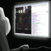
These are the new cards and wallets that were made, along with the old card in the top left for comparison. I'm aware of why these were made. The ID cards preceding the clean square look were also diagonally slanted, and people are nostalgic. That's a fine reason to want to want to change back, if you can improve on what currently exists. The aesthetic design of the card itself is something that I believe is an improvement over the horizontal cards, and if applied to the horizontal style would look great. However, let me quickly go over why these new cards were unfit to replace the old ones.
1: Most important issue: Not all of the icons have been rotated to match the alignment of the new cards. Regardless of if this was done out of necessity(due to the limited pixels available and not all icons looking good after being rotated) or not, it's incredibly sloppy and inconsistent and just comes across as an unfinished product. This is by far the biggest strike against the new cards, and they never should have been merged without this being dealt with. If it's impossible to deal with this issue, then the new cards should have been abandoned entirely. Yes, it sucks to have to abandon hard work after encountering an unsolvable issue, but that's how development works. The old cards were functional, consistent, and not aesthetically displeasing to look at. They should have never been replaced with something that looks this sloppy. It sets an extremely poor example for our codebase as a whole.
2: The stripe in the center of the card denoting the department with a different color surrounding the icon(and in the icon itself) is not immediately intuitive, especially compared to the older cards which had a consistent color for each department. This is just muddy design that can confuse people easily. The lawyer's card having the red outline is the most immediate example I can think of, giving less experienced players the impression that the lawyer is part of security's chain of command. The design should be immediately identifiable and informative at a glance.
3: The sprite itself just looks incredibly aliased and rough to look at. This becomes especially apparent on silver and gold ID cards, due to the contrasting colors. This is more of an aesthetic preference rather than a design flaw, so this point could be ignored, but it's one I know I'm not alone on.
tl;dr: New cards look inconsistent and unfinished due to the icon rotation issue, and the color patterns aren't immediately intuitive. Should never have been merged to replace perfectly consistent and functional cards. Nostalgia is not an excuse. Revert.